Improvising the Rule Writing
Experience for Salesforce IoT Cloud

The Begining
In summer 2017, I was part of Salesforce - IoT Cloud as a Product Design Intern at HQ, San Francisco CA. I bet it was one of my preeminent work experience that helped me develop product design thinking, cultural aspects and managerial skills at the enterprise level.
I still remember the very first day when I got right away pulled into a brainstorming session with the design team and product managers. At first, the product seemed a bit complex to understand since I was all new to the field of IoT at an enterprise level. But, as I got familiar with it and as well by attending the Product/Engineers meetings, it was clear that the product needed a re-design of several components to make it more intuitive and usable.
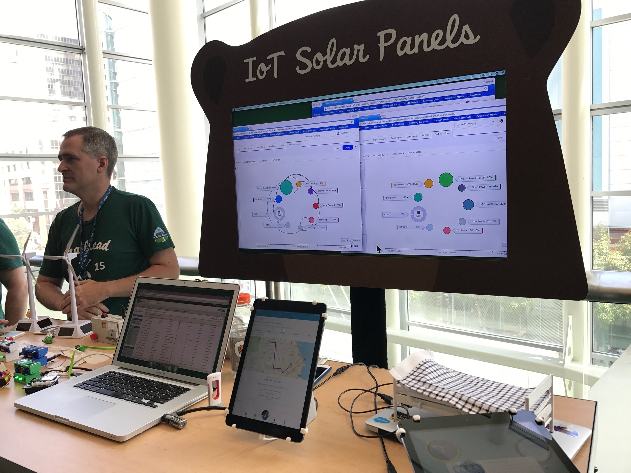
IoT Cloud is a new product launched by Salesforce targeting the IoT industry. Most of its components were not rethought after the initial release. In less than two weeks, I was already a part of significant and ambitious updates in the design and complete architecture of IoT Cloud product.

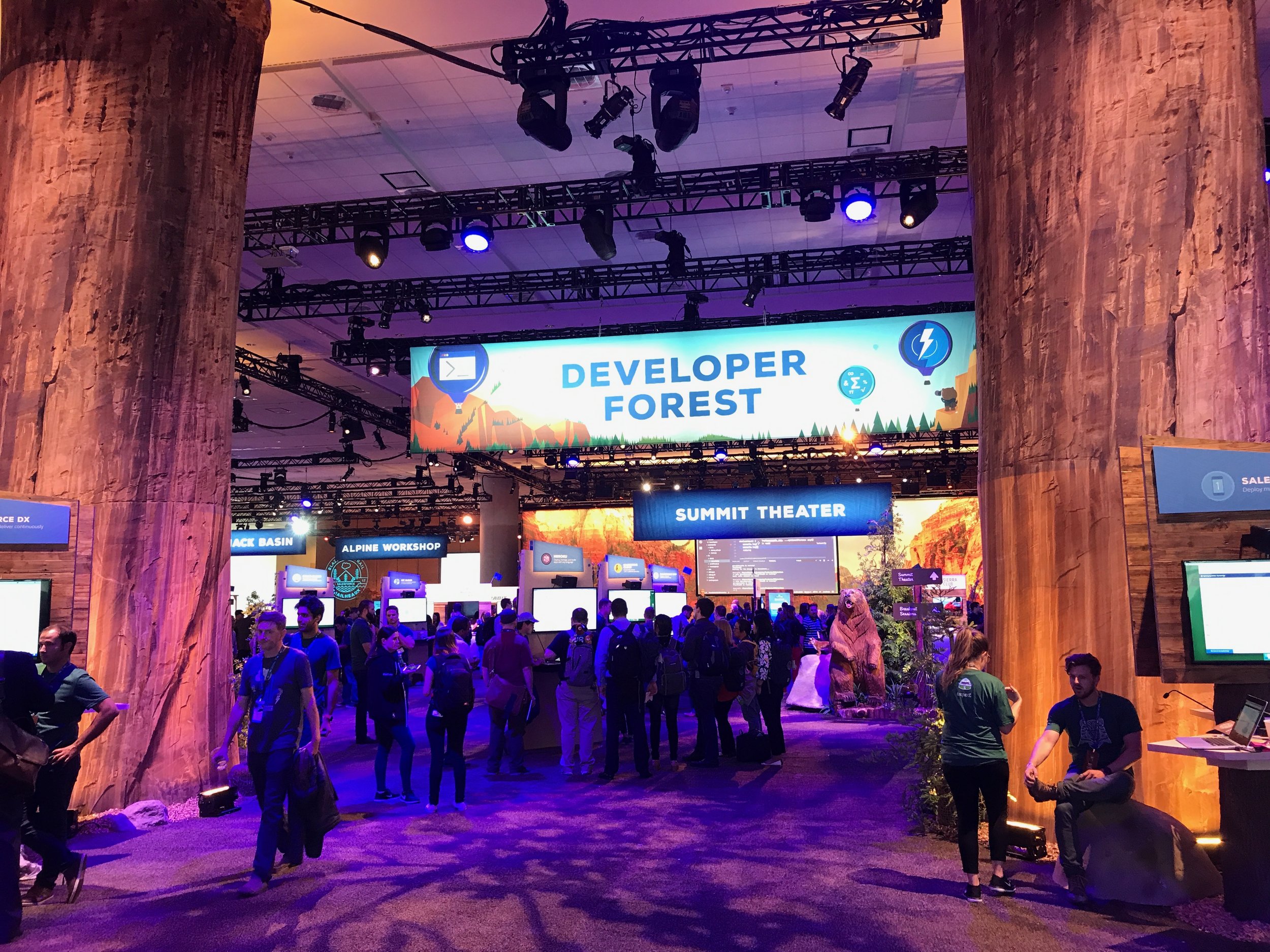
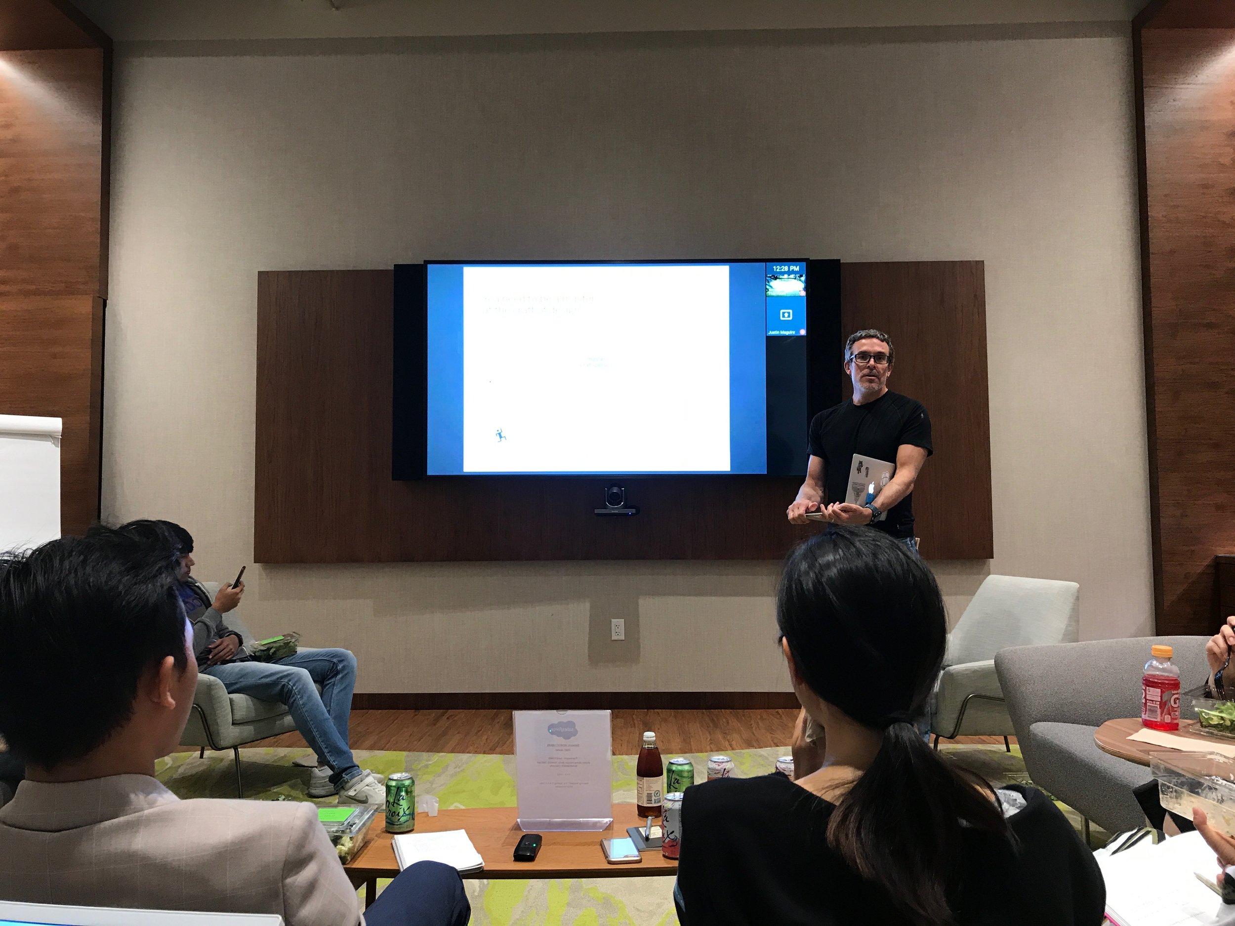
Our Salesforce IoT Cloud expert setting up for the TrailHeaDX Developers Conference 2017
Burgeoning
Internet of Things
In 2015, Salesforce had announced the IoT Cloud during its mega event, Dreamforce conference. The aim is to offer a “low code” experience for the users to generate automated workflows using the sensor data. i.e., even a non-technical personnel or a business user could pick, define rules based on different types of sensors connected and create an automated workflow.
By 2017, the IoT Cloud transformed from thousands of event handler to foresee an opportunity to handle millions or even billions of events due to its increasing customer base. Thus, thereby followed various design and usability challenges.
Devices, Data
and Customers
Friends: “Hey Abhi! What did you do this summer at Salesforce?”
Me: “Hello Friend! I worked with a brilliant team on IoT Cloud”
Friends: “Wow! IoT?? Thats amazing…”
---- A Brief Silence ----
Friends: “Err…Wait.. So, what exactly is IoT?”
Well! That's how my first encounter was with everyone that I met after the internship period. That is totally understandable since it is a B2B product. I am pretty much sure that you too might have the same question. So, to better understand the work I contributed, let's have a quick introduction to how the IoT cloud is setup and beneficial to the customers.
Note: If you are already aware of the product, please skip to the next section
For instance, let's say you owned a printer manufacturing company and you are doing very well with the printer sales global wide. Let's also assume that this company manufactures ‘ink’ related to the printers.

Problem: For example one of the customer’s printer is running low on ink, and the cartridge needs to be replaced, he/she would approach 3rd party vendors such as Amazon or best buy to order/purchase the cartridge. This 3rd party purchase creates a loss for our printer company in the ink/cartridge sector.
Solution: Since every printer emits signals error codes (such as “Low on ink”), IoT cloud could be set up in such a way that it could monitor those signals proactively and trigger for an action based on the workflow defined. For the above example, the moment the printer emits an “ink on low” signal, IoT Cloud could trigger a marketing email to the customer to choose the best deal for the cartridge.
It's just not about creating new business opportunities by combining the sensor data with the CRM data, but it is also about proactive monitoring. How excellent is a service when there is no need for a customer to call up and complain, rather than to be able to predict the state of the device and advise in advance? Isn't it a dream of every business owners.
Connect, build,
deploy and relax!
The IoT Cloud product is divided into the following five steps.
1. Connect Devices: The devices here are referred to the data signals emitting devices such as thermostats, wind turbines, etc. are connected through the HTTP requests.
2. Groom Signals: The data is usually a JSON code and hence, you would want to take the meaning full attributes/data so that to perform business logic in the next steps which could be done by code or by point and click approach.
3. Associate with CRM: Now that you have filtered the right type of data from the incoming signals, at this step you would combine the CRM data, i.e., the contextual data about your customer ( for example, customer records in Salesforce, etc.)
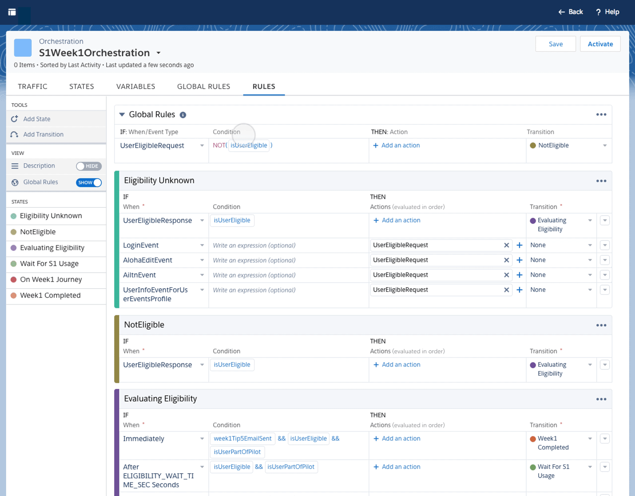
4. Define Rules: IoT cloud uses states machine approach instead of a linear workflow process. Hence, it consists of states and transitions. The rules are defined in every state. The rules are generally the business logic conditions such as “If this, then that” and in this context, the rule-writing experience is called as “orchestrations.”
5. Outputs: The outputs are the actions that are resulted based on the triggered signals or events in an orchestration. The outputs could range from sending an email, text message to opening up a service case in the service cloud of salesforce.

Setting the
Initial Goals
As the product needed to scale up to handle billions of events, our initial mission was to change few structures of the product right from the architectural level, but keeping in mind about the existing customers as well as the time, only a few components were proposed for a change.
Our goal of the project was to provide a better experience on top of the existing, adapt to growing business needs and bring in more of a point and click approach as of other Salesforce products so that to attract more business users.
Hence our high-level goals are as following:
1. Make the setup process as quick and intuitive as possible.
2. Give business users better control over the interface by point and click approach.
3. Keep it less clumsy yet provide an engaging experience.
4. Follow the Salesforce design principles
5. Avoid designing of new UI components
My Role
I was a part of 5 designers which consisted of seniors, lead, and principal designers. During the project assignment, I was asked to choose between 2 projects from the list of scoped down requirements which were Orchestration Experience (Rule Builder) and Grooming of Signals. After discussing with my team, product managers and researchers, I fell in love with the Rule builder experience since most of the users spent a lot of time at that phase and had some exciting challenges.
I reported to the design lead and collaborated with 2 product managers, one researcher, two solution architects and one content strategist.
Most of the validations of my ideas were through 1:1 meetings, design critique sessions and team presentations which were attended by main stakeholders.
60% of my internship period was spent working on this particular project which is improvising the rule builder experience.
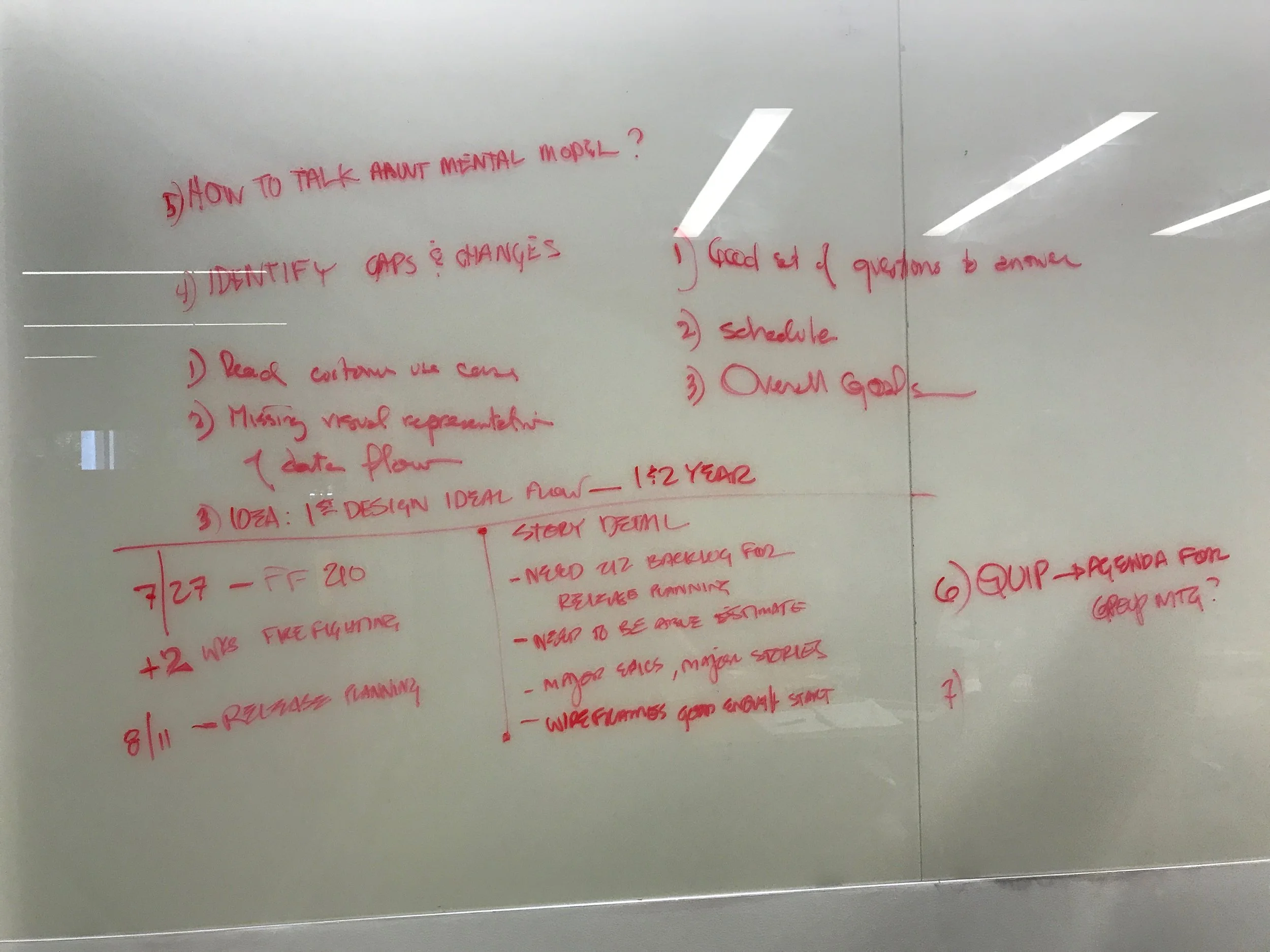
The Kick Start
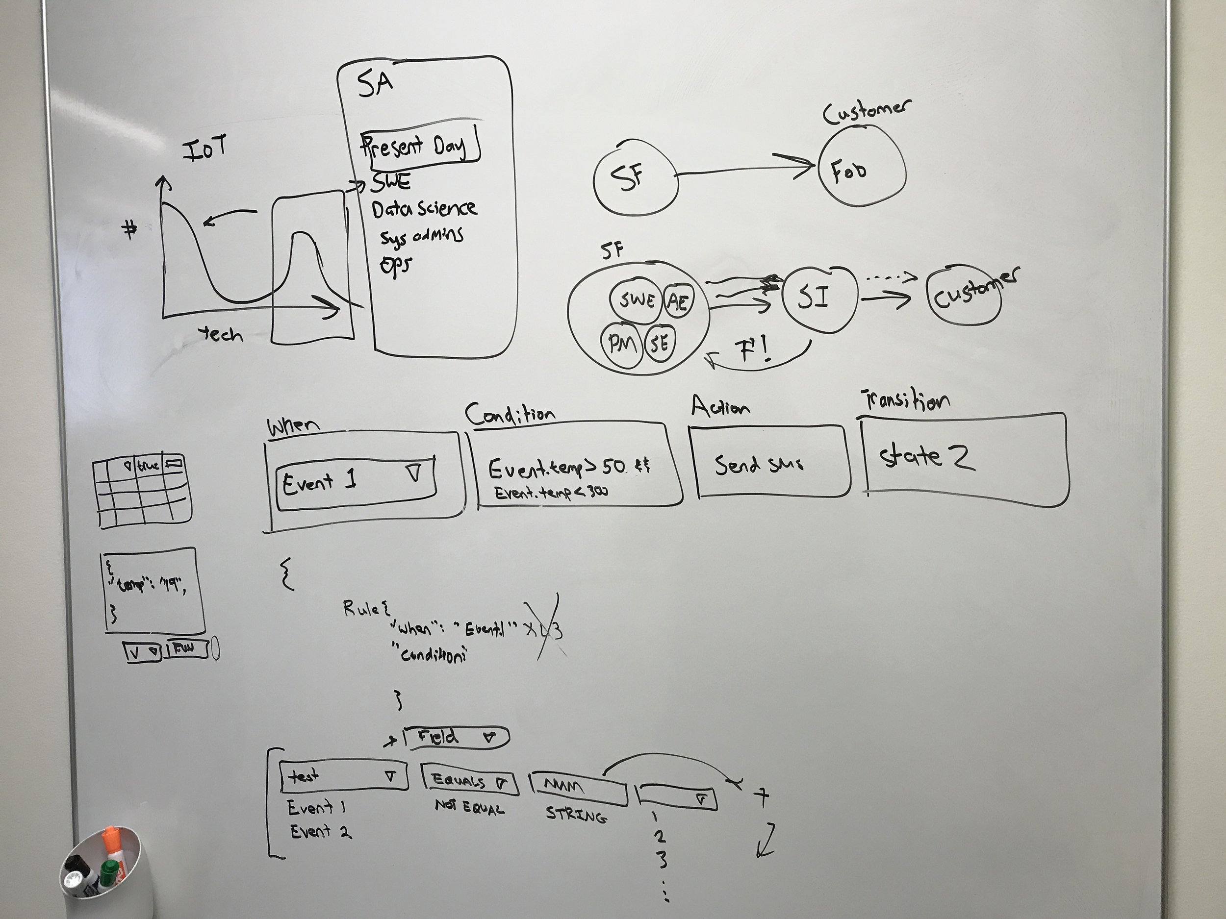
There was not a specific goal defined for improvising the rule builder experience. So, I, as a naive user (naive since I am also new to the product) collaborated with one of our solution architects, took few example scenarios and built a working demos of the product. This gave me a better understanding and few insights about the pain points that may have affected during the setup journey. The rule builder experience is just not about defining rules. Since a state machine could have ‘n’ no.of states and ‘n’ no.of rules within them, there were few other features hidden inside to make the rules less clumsy. They are Global Rules and variables.
Global Rules: Global Rules can be used for if a particular rule has to repeat in all states, or to exit a journey at any time. These are evaluated before regular state rules.

Example: Lets say if want to build a rule such as “At any point of the journey, if the event turns into “ER9421” then immediately escalate the process”
All you need to do is type: If when: evtCriticalError Condition: Error_code == ER9421 Transit: “Printer Warning Escalation” in the global rules tab.
So, in this way you don’t need to write the same code in every state.
Variables: Variables are generally used to define constants. For example, if you want to measure a temperature value with the previous data, then you could define a variable to store such data.

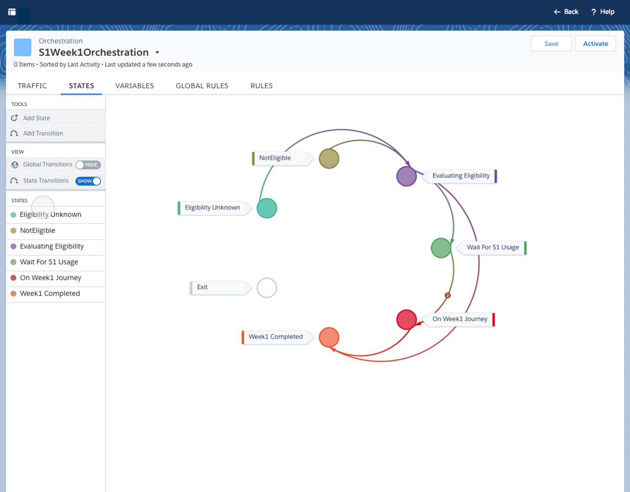
Also, the rules (transition based) can be defined in a graphical view of representation called the “States" view tab:


Understanding the Users and their Problems
I partnered with the 2 product managers to explore how the customers were setting up the product and also to go over few complaints that they received in the recent times. There was also some research work done during the initial release of the product. The solutions architects were even a good source for collecting the pain points since they are ones who help the customers whenever they are stuck.
In general, the Salesforce IoT cloud has the following personas:
a. IoT Admin
b. IoT Composer
c. IoT Architect

For the Orchestration experience, we are considering an IoT Admin and a Composer since they are the ones who will be either composing or monitoring the rules in the real world.
“Guess less and put the efforts in framing the problem.”
When you first encounter few challenges, we are generally in a hurry to come up with solutions which is absolutely not a good practice. Empathy is the core of understanding the right problems to the right audience.
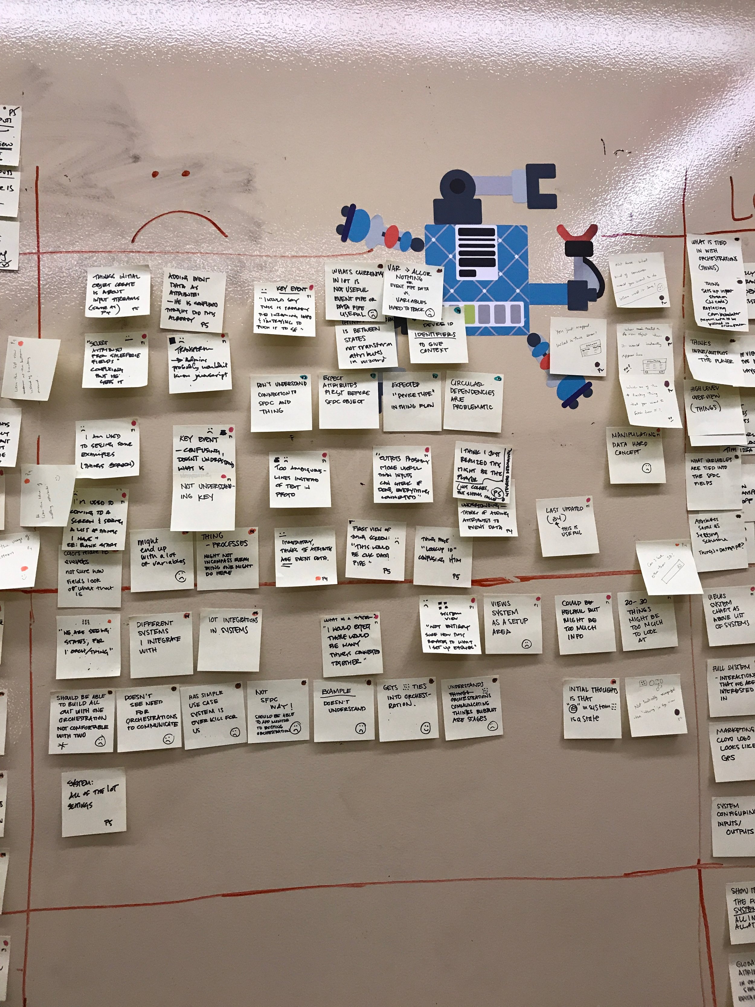
So based on interviewing 4 actual customers <2 Admins + 2 Composers>, 2 product managers, four solution architects and existing with the existing complaints, the following are the challenges faced:
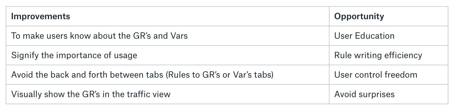
1. Global Rules and Variables are hidden inside a separate tab
3/3 customers did not notice the Global Rules and variables, thus did not know the value of them.
2. No description of Global Rules in ‘Global Rules’ Tab or for Variables
Within each of those tabs, no precise information explains what a Global Rule or a Variable is, and its advantages.
3. Users do not understand that GR had applied in traffic view
In the traffic view, users generally forget that a global rule had applied, thus makes them confuse of few transitions. For example, as explained in the previous case, The user is on the ‘traffic view’ and notices that a particular instance had escalated the process, which makes him/her worry.
4. Variables are used in the ‘rules view’ but are not clearly visible
Currently, the variables are similar to that of a general code and hence makes the user to ignore them and later worry about defining too many same/alike variables.
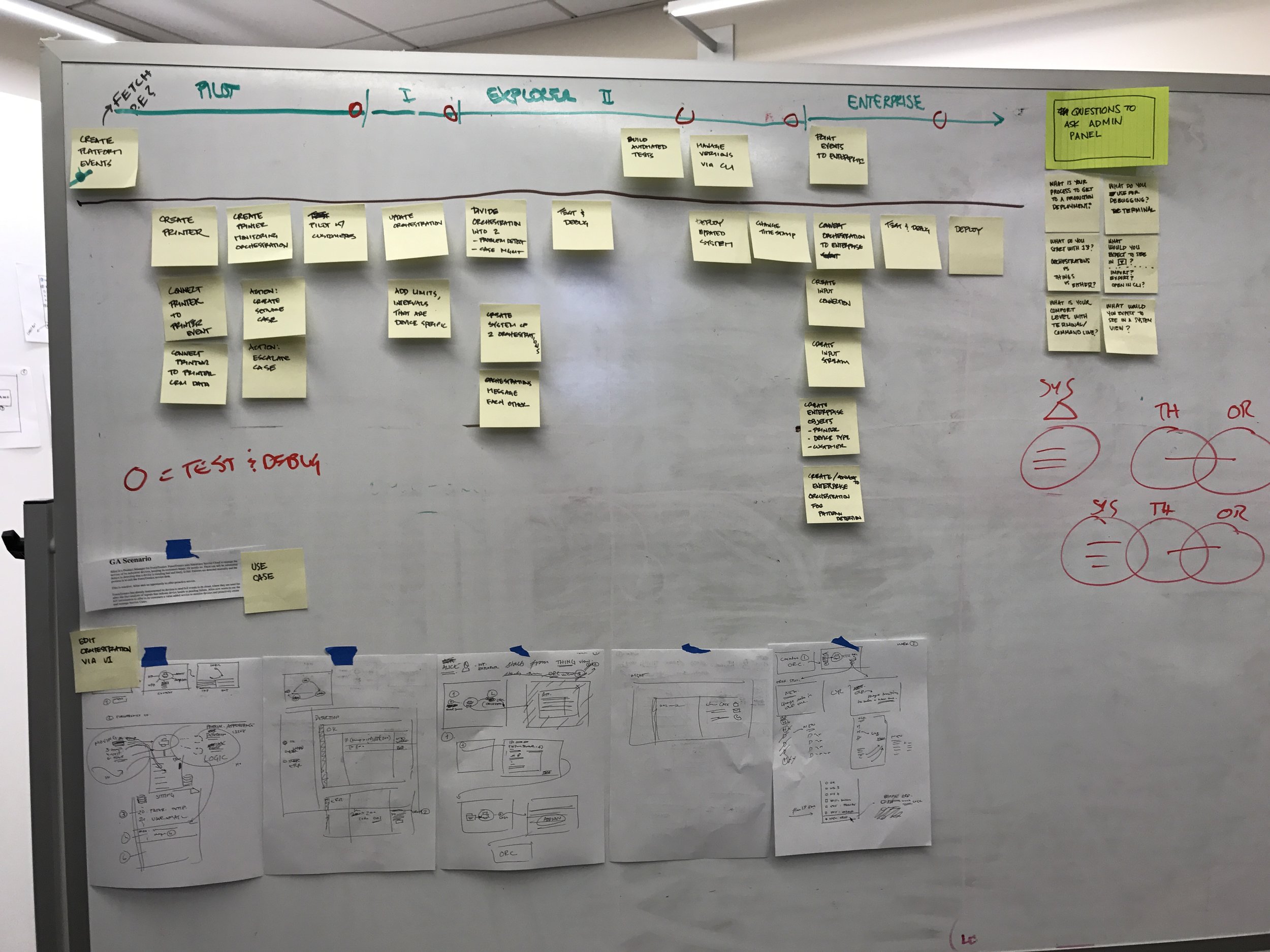


Scoping down
the challenges
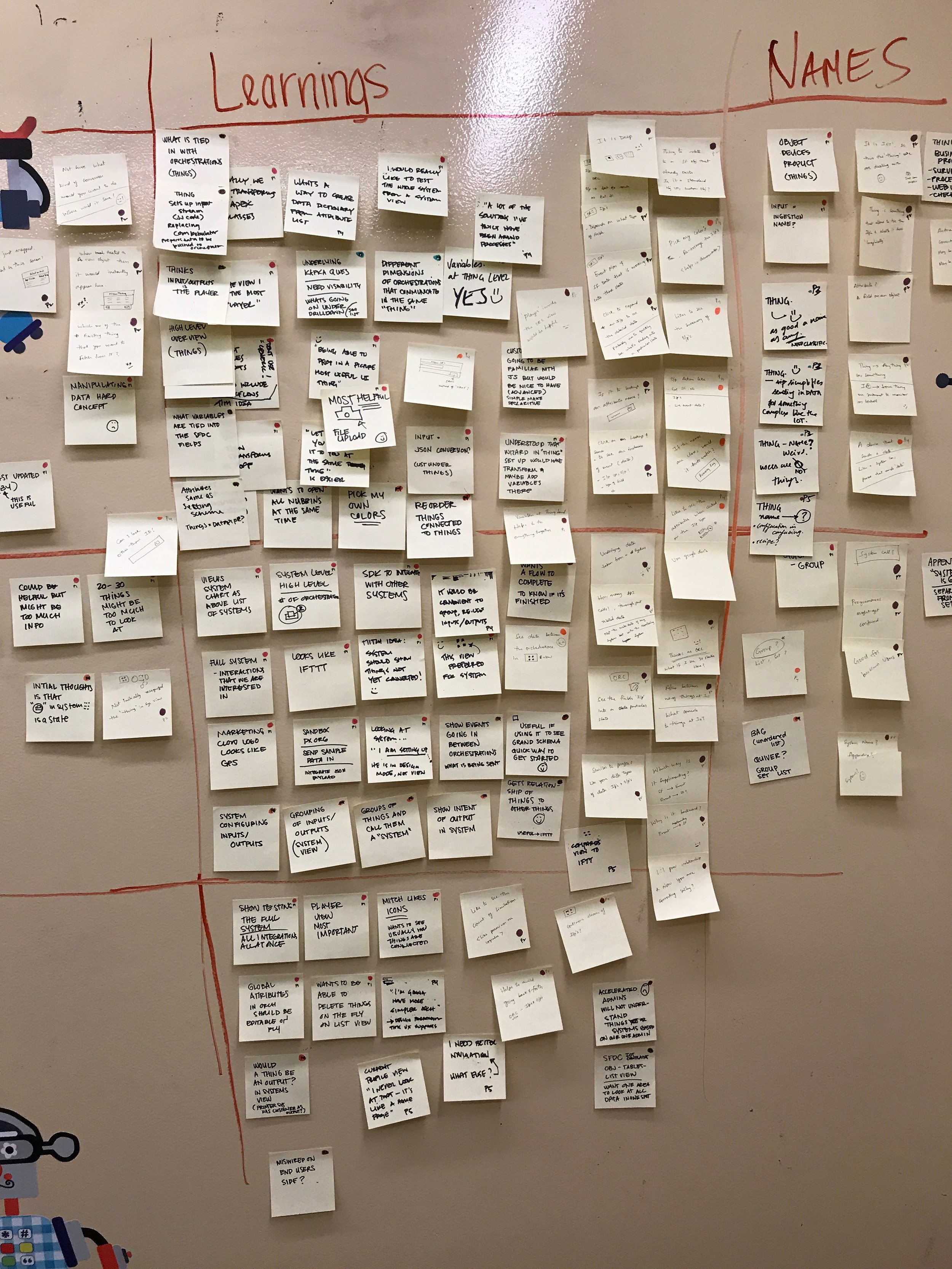
So, after the initial insights gained from the interviews, it was the time to decide on the deliverables based on the time I had. Since the product was divided into components and assigned based on the interests, we all (designers, researchers, product owners, SA’s and Engineer director) came together to discuss on scoping the requirements for the Sprint. Individually we presented the different pain points and divided them into MVP and ideal scenarios. We also had the previous UX metrics for the IoT Cloud experience discussed to make sure that essential points are recognized.
A lot of effort went in to push as many pain points that were necessary to a smooth rule building experience. To better portray different scenarios, I started thinking the problems in different perspectives.
After the interviews, it is time to define the POV’s (Point of views) I felt that even though the product had a specific persona, but in one level up, any of such personas could be defined as two types of users in general. They are:
1. Well, as the name signifies, first-timers could be a user entirely new to Salesforce or a user who might have some previous experience with other Salesforce product but new to the IoT cloud.
2. Experienced Users:
Generally, the ones who have already been using the product.


Inspired by the Job story framework, below are the different stories that helped me give rich insights into the actual problems that are needed to be addressed as a priority:
Job Story #1
Situation: When I reach the orchestrations view after the setup process,
Motivation: I want to get insights on different elements of the interface
Expected outcome: so I can start planning on converting the business rules to actual rules in the product.
Job Story #2
Situation: When I am working on the rules
Motivation: I want to know better ways to define the rules
Expected outcome: so I can feel like I am not wasting too much time just by not recognizing the helpful features.
Job Story #3
Situation: When I am working on the ‘global rules’ or ‘variables’ in the rules view
Motivation: I want to avoid going back and forth between the tabs.
Expected outcome: so I can concentrate better in one place and avoid unnecessary bugs.
Job Story #4
Situation: When I look at the ‘traffic view.’
Motivation: I want to to see how the instances are traveling across different states,
Expected outcome: so I can verify if the deployed rules are running exactly the way I planned.
So based on the above framework, let’s understand the proposed improvements for the above types of users and the reason behind them:
The Success and its Measurement
The overall IoT product already had metrics set up from the very beginning of the launch in 2015. But exclusively for the orchestration experience, this needed a unique framework to define how the success looks like, and how would it be measurable.
Before getting into too many technical details, a reasonable amount of time was spent on going through the past data and discovering the apt resource to make a measurable plan. We found the framework called “HEART” by Kerry Rodden, Hilary Hutchinson and Xin Fu from the Google’s research team as an extremely useful tool to measure the product user experience.

For our scenario, we have considered testing upon Task Success, Engagement, and happiness and omitted the adoption and retention factors since this is a product where an exclusive type of person works on it.

Further, this gave a better understanding to differentiate the problems for different user types and put them effectively into “How might we’s.” Following are the key design challenges:
First time users:
HMW educate that there are Global Rules & Variables in the rule-writing experience?
HMW signify their uses/advantages for the user?
HMW avoid the problem of a user going back & forth between ‘global rules’ tab and ‘rules’ tab?
HMW show the global rules in the state's view?
Experienced users:
HMW show that Global rules exist for a user who had used the product for a while?
HMW show the global rules in the state's view?
Yeah! It looks like there are too many “How might we’s” but most of them are dependent on nature.
The Redesign
The core aim of the Salesforce products has always been to see its customers succeed. With a new tailored experience and in addition to updated lighting experience (Salesforce 2018 design systems) makes the rule builder experience/orchestration experience more fun, exciting and gets you familiarized within no time.
Flexible and Stay Focused
Now focus better on building the logic by accessing the information right on the rules view without having to jump into other tabs constantly.

The global rules can be seen on the top of the general state rules (sticks on top) upon clicking on the toggle present under tools in the left nav. You can also make the best use of the accordion feature which helps to access or view the global rule when required.
Variables are assigned with a unique color code to differentiate with the rest of the code. Also, to quickly know about a variable, now all you need to do is simply hover over it.

Space Matters
For an information-heavy interface, scan and scrolling through the rules is a primary task. We did not want to show the global rules always occupying the same space every time. For a user to help focus on what’s essential for him/her, the height of the global rules section seamlessly adjusts to a minimum height so that to accommodate more state rules in the viewport.

Advices The Best For You

There is always a best practices for rule writing recommended for the users. Now, IoT Cloud understands your rules writing pattern and recommends/prompts about global rules or variables to make your job easier.
Keep Calm and Get Informed
Now with one click away, you can see how the global rules are affecting your orchestration in the state's view.
Simplification At Your Service
Sometimes its hard to differentiate the various types of Global rules or variables since there is a prioritization of the order in which they are initiated. Now the product saves your time by organizing the different types to communicate the order of initiation. A clear description of every title, also makes it easier to understand and start composing efficient and bug-free.

This is how
we got there
The Eternal Frame Work
To me, the Stanford’s d-school framework never gets old as it always helps anyone jumpstart into any design problem that guides towards the right outcome.

Stanford d.school’s design thinking framework.
The concepts of Empathize and Define had given better insights in framing the problem statements clear and crisp. We also had the UX design metrics (HEART) defined to test the success for the future and as well for the initial test phase with few participants (test subjects). The following were the key design challenges formed for different user types:

‘The fix’ in the above table explains contextually about how the solution outcome could be. Well, the fixable words for each of the table item are just a gut feeling but let’s see how we got there.
A lack in focus
had led to a lack
in progress
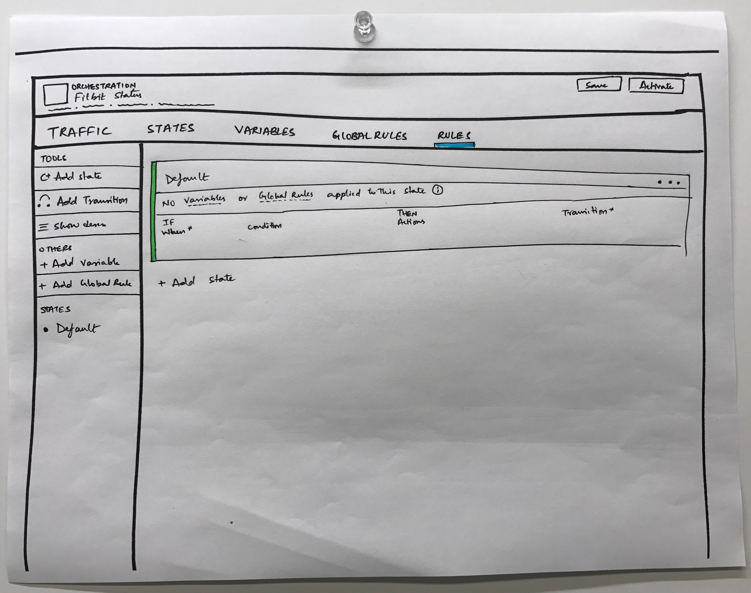
The architecture of the product was designed in such a way that you can set up the product ones and change the rules in the orchestrations based on the business requirements. Hence the previous studies showed that most of the active time of a user is spent in the “orchestrations” component and especially in the “Rules” tab.

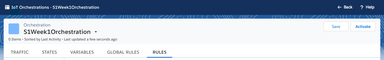
Existing Interface for the "Rules" tab view
The data form the user, and stakeholder interviews showed that:
A majority of the first users have not noticed/used the features of global rules or variables. hence, they just started with writing a code normally.
After clarifying with the SA’s, users define the global rules and the variables but often times forget that they have defined them.
Most of the time there is always a bug related to Global rules or a variable when defined by a user on his/her own, that might be resolved later by an SA or a product manager.
Majority of the users get confused whether they have defined a particular type of variable to re-use them in the code. Hence often open up the tabs separately and switch to view.
“Clarity affords focus."
-Thomas Leonard
Inspired by the above quote, clarity and the focus are two main components to solve this problem. Since most of the time is spent on the “rules” tab, there should be a clear and smart way of representing the global rules and the variables along with the general state rules but also keeping in the mind that it should not look too occupied.
The First Iteration:
No matter which state you are at, the variables and global rules can be seen by a simple hover


The proposal of showing the global rules and the variables resonated well with the stakeholders. Especially they saw the value in including the global rules in the “rules” view. The only foreseeable usability issue was with the hover interaction. i.e., the hover state is a read-only style, and it would be amazing if it could be editable then and there itself.

Is it vital to show the global rules and variables all the time? Its clear from the studies that users expect to see them so that they could avoid going back and forth but, at the same time the <50px X the container width> is still a significant amount of space occupied in every state, and that could lead to a hefty information shown to a user unnecessarily.
A Toggle To View When Needed:
To match the mental model of a user, global rules are required when the user wants to see how it could affect the complete orchestration. Generally, the toggle is used in the settings screen, but getting it used in the “rules” tab helped to solve the spacing issue.


Further, a feature to be able to pin it on top such that the global rules are still accessible in any viewport.
When a global rule is defined, it is usually applied to every state rules, and that is not communicated well in the existing experience. So, I was also investigating some ideas for it like for example, showing an icon in every state to represent that a global rule has been applied.

Educating the user
in the right way
Majority of the users’ nature is to try the product right away. Even if there is a quick tutorial upon landing a particular page, still the user would skip over in an effort to get going with the application. Also, there is high chance that the users who do not skip the tutorials are unlikely to remember what they have just learned.

Josh Clark's tweet about tutorials
Josh Clark had a great approach that instead of using the upfront intro tutorials instead teach the users in context, i.e., when they are actually using the application, and that's when they can use a tip the most to educate just in time.
So in our application, the right time to educate the user about using the global rules is when they actually duplicate the same rule in every state so as to exist within all the states rules.

A scenario when user types the same type of rule in every state

Iteration 1: A pop-up to teach the user about using the global rules

Iteration 2: A toast instead of pop-up
Less was
actually less
There is a famous saying that “Less is more” but sometimes it does not go well. The studies show that for the first time users there was a humongous bounce rate whenever the user landed in the “global rules” tab or the “Variables” tab.

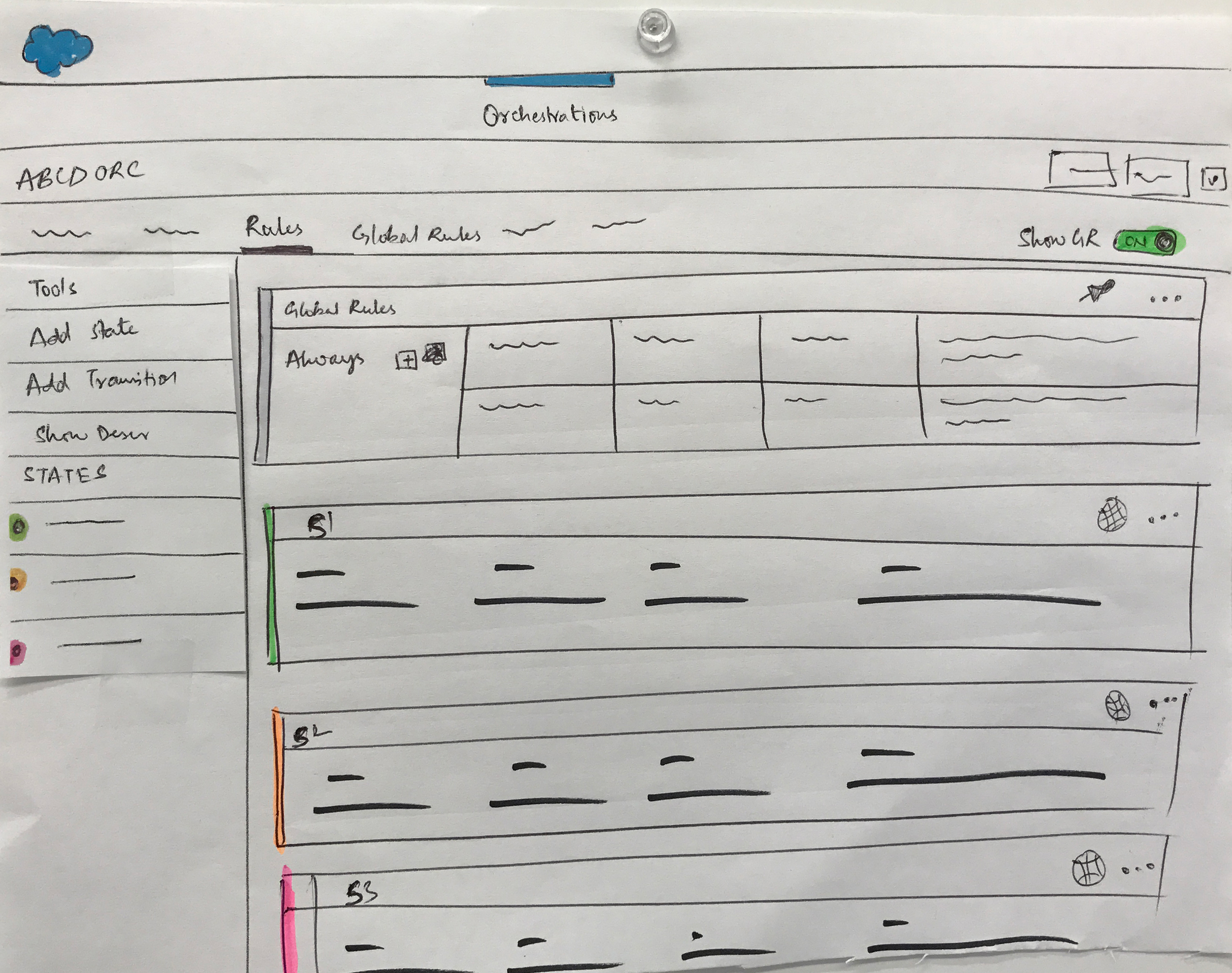
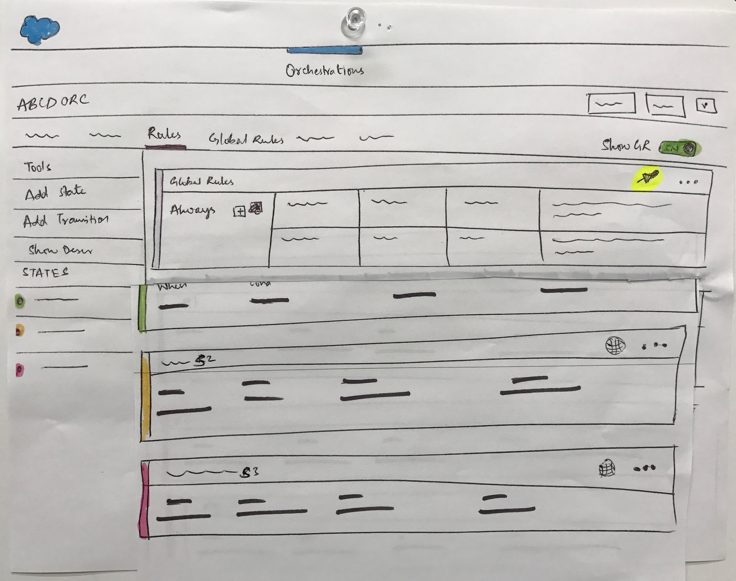
A "global rules" tab view
Now that the proposed ideas have few more components added to the “rules” tab, there is a necessity to also educate the same in the respective global rules tab and variables tab. So I proposed the idea of having a clear description and collaborated up with a content strategist to come up with a simple and straightforward explanation.

Uncovering
the covert
Previous usability results showed that the business users use the states tab view to communicate the business logic. The interface for the States tab allows to create or update states and define/update the transitions. But the problem is with the global rule transitions which often leads to ambiguity since they are hidden.
For a representation which consists of defining states and transitions, there is also need to show the underlying transitions which in this case are the global rules. Global rules apply to all the states, and there is a clear opportunity to make them seen in a meaningful way.

The toggle button had helped to show or hide the global rules based on the necessity in the rules tab. Utilizing the same concept in the “States” view, we were investigating different ways of representing the global rule transitions.


Reorganizing
the information architecture
The current interface has the tabs organized in the following way:

i.e., if a flow chart is drawn for the above IA representation:

As per the architecture of the orchestration experience, the rules are initiated in the following way:
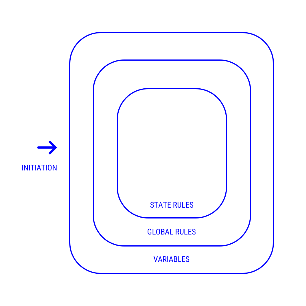
Investigating the relationship with the way the tabs are ordered and with the way the rules are initiated, there is a clear opportunity to educate users subconsciously. So, the hypothesis is to feed the initiation process into the users mind unconsciously by arranging the tabs in the way the initiation order is. There was a debate with the stakeholders on reordering the tabs styles, but eventually, they got convinced with the foreseeable outcomes.
A new proposed way of IA for Orchestrartions

Shaping
into pixels
After exploring through different iterations of ideas, it was the time to design the visual layouts for the proposed ideas to get them ready for the usability test with the real participants. Salesforce design systems had been working on coming up with a new lightning experience for the winter 2018 release. Hence the designs were carefully tailored to match the new salesforce design language.
For the usability testing, few of the stakeholders wanted to see how the accordion style of representation for the global rules might work and hence we have planned to conduct an A/B testing.
Design Set-A

Design Set-A used the toggle feature
Design Set-B

The design Set-B has the accordion as a feature
For conducting the usability testing, I have partnered up with the researcher and designed a plan to test with 12 participants. The test was mostly quantitative based, and the recruited test subjects were from United States, Europe, and Germany. The interaction was also kept two-way so that to fill the metrics defined for the user happiness in the HEART framework. Participatory design method was also included as a part of the test to understand how the user perceived a design according to him/her.
Post
Usability Testing

The design A was a clear win in many aspects. But there were also few intriguing points raised by the participants. Overall the test results gave a chance to refine the design from better to the best.
One of the observations amongst them is the placement of the toggle button. Participants did notice the new toggle feature but confused as to add a global rule instead of show/hide a global rule. This is basically the closure property issue where the global rules toggle is present along with the “Tools” in the left navigation.
Necessary feedbacks were considered and changed accordingly based on the user data and were finally documented and handed-off to the developers.
Few take-aways:
Guess Less:
There is always a tendency to get started with the solutions after hearing the design challenges which lead to faulty design outcomes. Try to guess less and focus more on the user, business aspects to better form the actual design challenges.
Empathize, Empathize and Empathize:
Empathy is one of the core elements of the design process. Spend as much time you could to understand the user’s perspective and context in and out.
Define a Metric To Test You Success:
For designs its hard to judge if the proposed designs work well in the real world. Also, it is not just about the analytics numbers. Setting up a framework helps in exploring the problems in the right way and eventually leads you to an accurate outcome.
Brainstorm and Get Your Design Critiqued With As Many As You Can:
Always welcome the stakeholders to join the brainstorming sessions. This way you can understand different perspectives like product owners, directors, product managers, etc. Design critique is also a powerful way getting the feedbacks and chance to unveil few points that you have never even thought of them.
Just Draw It:
That’s true! Just put your ideas on paper. Doesn’t need to be a well polished design.
Expose Your Designs:
Exposing your designs gives an opportunity for a quick critique. The SVP Product Design and User Experience of Salesforce, Justin Maguire had this fantastic advice during one of our lunch and learned sessions. Just have your designs printed and pasted on the wall near your desk. That's it! You will see the magic.
I sincerely thank my mentor Tiffany, Product Design Lead and special cheers to Tim S, Principal Product Designer for guiding me through the design thinking process. Cheers to Marcus B, Staff Product Designer for helping me get out of showstopper issues.
A special shout-out to my product managers Michelle and Justin for patiently going over the problem and baring with my innumerable “what-if’s.” Thank you for the valued feedback on presentations Tim, product manager. I would also like to thank our Solution Architects, Salem and Kapil for helping out gather the customer pain points. Last but not the least, Thank you for everything Salesforce!